
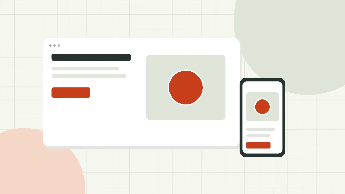
Painstakingly reducing text, constantly swiping from left to right and back again, not hitting the order button even on the third attempt (or not finding it at all) - you probably also remember these experiences with mobile display of websites. But with responsive web design, this is a thing of the past. In the following article we will not only explain what responsive web design means, but also give you three important reasons why your website should be responsive.
What is responsive web design?
Admittedly, technical terms and abbreviations are thrown around, especially in the web design industry. CMS, hosting, JavaScript and SSL – it couldn’t be more complicated. Fortunately, as a layperson you don't have to deal with most of the terms.
But you should listen to a technical expression: responsive web design.
Responsive web design is a website design technique that allows your website to be displayed correctly and, above all, in a user-friendly manner on desktop PCs as well as on smartphones and tablets.
Loosely translated, responsive web design means “reactive web design” and means that the display of your website adapts to the viewer and their device and not – as was the case a few years ago – the other way around.
Fonts change size, images appear smaller or even disappear completely, and order and contact buttons are no longer located outside the small screen.
With a responsively designed website, the user gets all the important information at a glance, regardless of the device they use.

Are you still scrolling? Why responsive web design is essential
What might have been considered a trend years ago is now a reality: Forecasts show that the number of users accessing information on the Internet via mobile devices will increase to 3.22 billion users by the end of 2019.
So it doesn't matter whether you offer your services as a craftsman, your wine in the online shop or announcements about the next city festival online - your website must look perfect on mobile.
The following three reasons prove why responsive web design is essential:
Responsive web design influences your Google ranking
The constantly growing number of mobile users has not gone unnoticed by the makers of the world's largest search engine, Google. And they responded. Only recently Google announced serious changes in indexing: for the evaluation of websites and the Determination of rankings The mobile version of the site is now used.
In concrete terms, this means: The so-called crawling (the automatic search and analysis of websites) only refers to the mobile display of your site. If error messages arise, the site is not designed to be mobile-friendly or there is no mobile version, Google will penalize your website and your rankings will drop drastically.
And let's be honest: who looks at the search results on page four, five, six or even further back?
Satisfied users thanks to responsive web design
The patience of your website visitors is short because the flood of information on the Internet is huge. On average, you have about 30 seconds to convince a prospective customer of your offer on your website.
Conversely, this means: Even - or especially - in the mobile view, the user has to get the information they are looking for with just a little scrolling. This is not just a conceptual question (of course you should present your offer or website goal as high up as possible).
The technical implementation, the responsive web design, must also be error-free: Buttons must be displayed appropriately large so that the interested party can easily tap them, text size and orientation must be adapted to smaller screens so that the reading flow is supported and images must also be scaled accordingly or omitted entirely.
One thing is certain: it doesn't matter whether your target customer is 65 or 35 years old. He will definitely access your website on mobile.
Your website manager will love responsive web design
External agency or in-house supervisor – you can make everyone happy with a responsive website.
When mobile internet usage was still in its infancy, progressive companies relied on different designs for their websites. In addition to a desktop version, a version for smartphones and another for tablets were also designed.
Such solutions still work today, but the maintenance effort is disproportionately high. Because for every blog post, every piece of news and every image that you want to put or change on your website, your website manager has to create at least three different variants.
However, if you invest a little more effort in responsive web design at the beginning of planning your website, all later adjustments will automatically be displayed perfectly in the respective screen resolution.
Your supervisor will thank you. And have time for more important projects.

Tips for responsive web design
If you want to build or relaunch your website on your own, you will find lots of tips and tricks for responsive web design on the Internet. We give you the three most important ones:
Set the smallest screen resolution. Right at the beginning of the website concept. This will be the basis of your design. Because it is much easier to fill more display area later than to reduce it afterwards for smaller resolutions.
Consider the lower data bandwidth. Mobile internet use with tablets and smartphones requires significantly less data than the desktop PC at home or in the office. Therefore, make sure that the amount of data is manageable and, for example, adjust the image sizes accordingly. This means your website runs just as fast on your smartphone as it does on your home PC.
Test live on the corresponding device. You can now set an appropriate resolution in any browser to test your responsive web design. However, you should also check it on your smartphone and tablet at regular intervals during the implementation phase in order to immediately identify any display problems.
Responsive web design is more than just another technical term from the IT industry. More and more users are surfing on mobile and therefore want to find your offer without the hassle of scrolling and searching. Therefore, check your website in mobile display and take appropriate measures if problems arise. And if you need help, then Just talk to us – we are happy to help you.
Stay in touch.